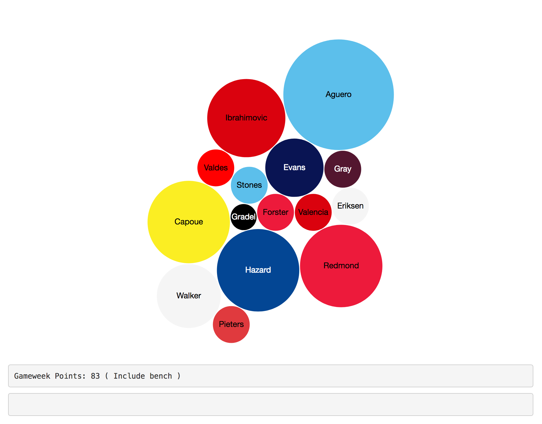
Last years FPL season Bubble Chart
Linked in this post is my 2016-17 FPL points by week visualised as an interactive bubble chart. The data was collected using a web scraping script I wrote in R and detailed in my previous post.
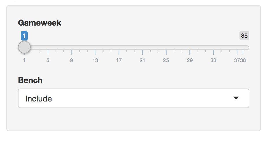
The larger the bubble the more points the player earned that week. If you are not on a mobile device, you can hover over the bubbles to reveal players points that week, whether they were sat on the bench or in my team and whether they were the captain or not. There is a slider for gameweek and a dropdown to include or exclude bench players.
Click here to view and play around with the chart.